
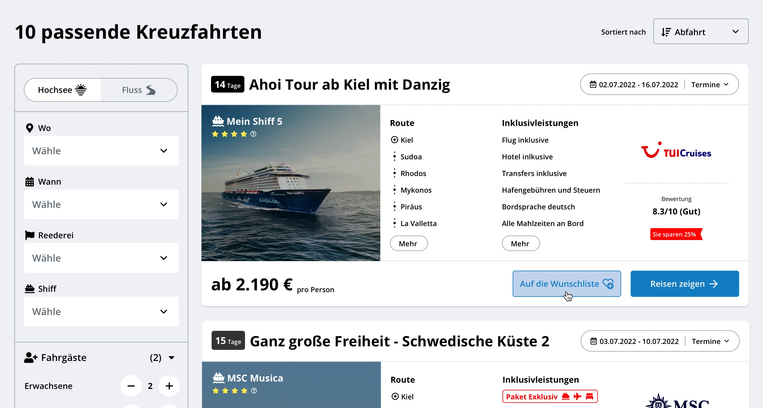
A Better Research Experience
E-COMMERCE / CRUISE TRAVELS
Redesigning the way customers research cruise packages through collaborative workshops, rapid prototyping, and iterative user testing.
At a glance
The challenge
Kreuzfahrtberater wanted to improve the way customers researched travel packages that included a cruise. The goal was to make the experience more engaging and competitive while encouraging customers to return during their research.
My contribution
I led the UX and design work from early research to implementation: competitive analysis, workshops, hypotheses, UI and interaction design, prototypes, testing, iteration, handoff, implementation reviews, and QA.
The outcome
Two rounds of unmoderated remote testing validated the core user outcomes. The refined solution redesigned existing pages with new elements and features, then moved through handoff and into staging.
Context
In October 2021, the Project Manager introduced an additional product goal that had not been planned on the original roadmap. It created an opportunity to rethink key research pages and offer customers a clearer way to explore cruise options.
This projetc objective was increase engagement, and encourage customers to return while researching a cruise.
The original brief targeted 15% more traffic than three main competitors on relevant pages within six months and up to a 5% increase in booking-request conversion within twelve months. These figures framed the work; they are not presented here as achieved results.
01. Research
Framing the problem
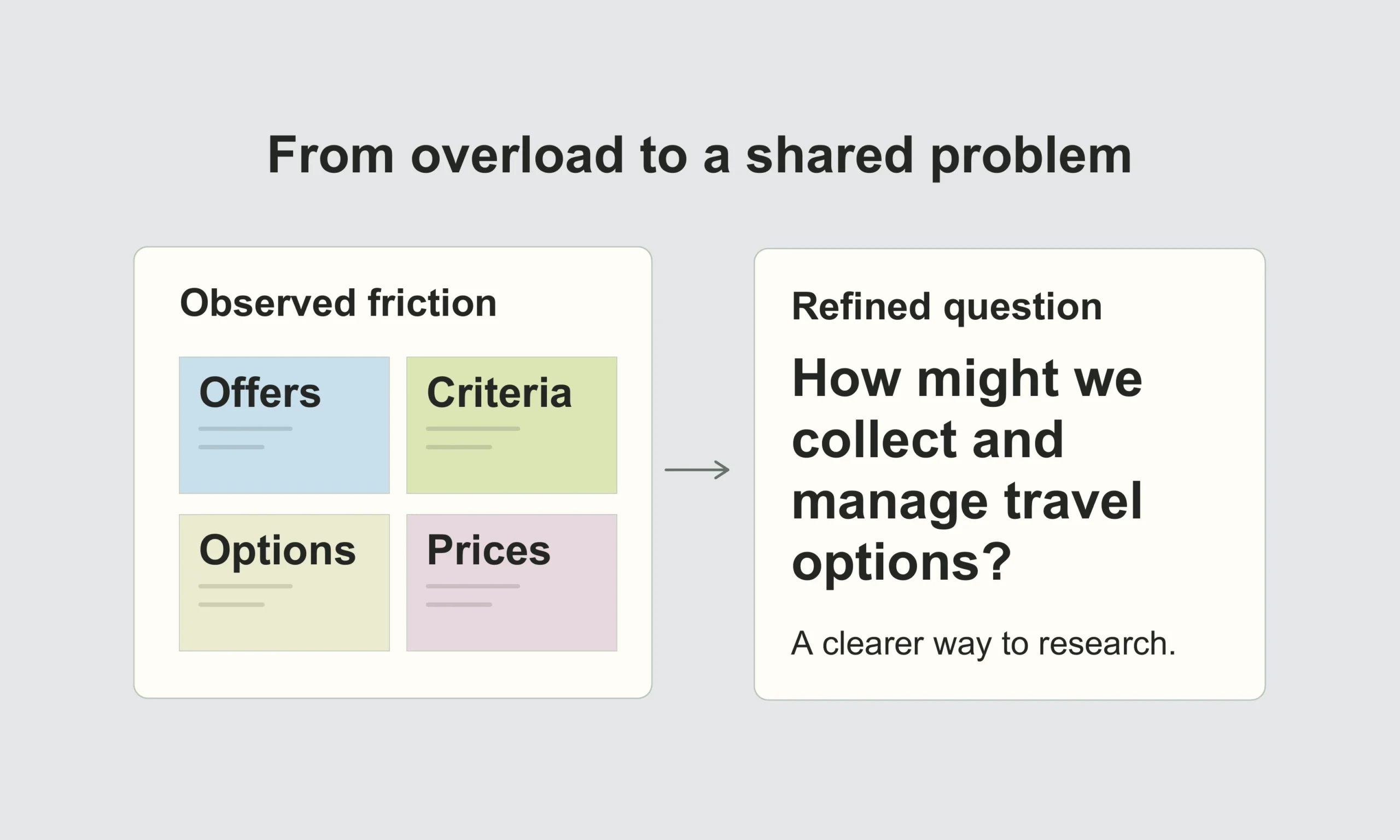
I began with a competitive UX analysis of relevant cruise and travel-research experiences. The goal was to identify recurring patterns, understand friction in the research journey, and refine the initial problem statement before discussing solutions.
- competitive UX findings;
- a refined problem statement;
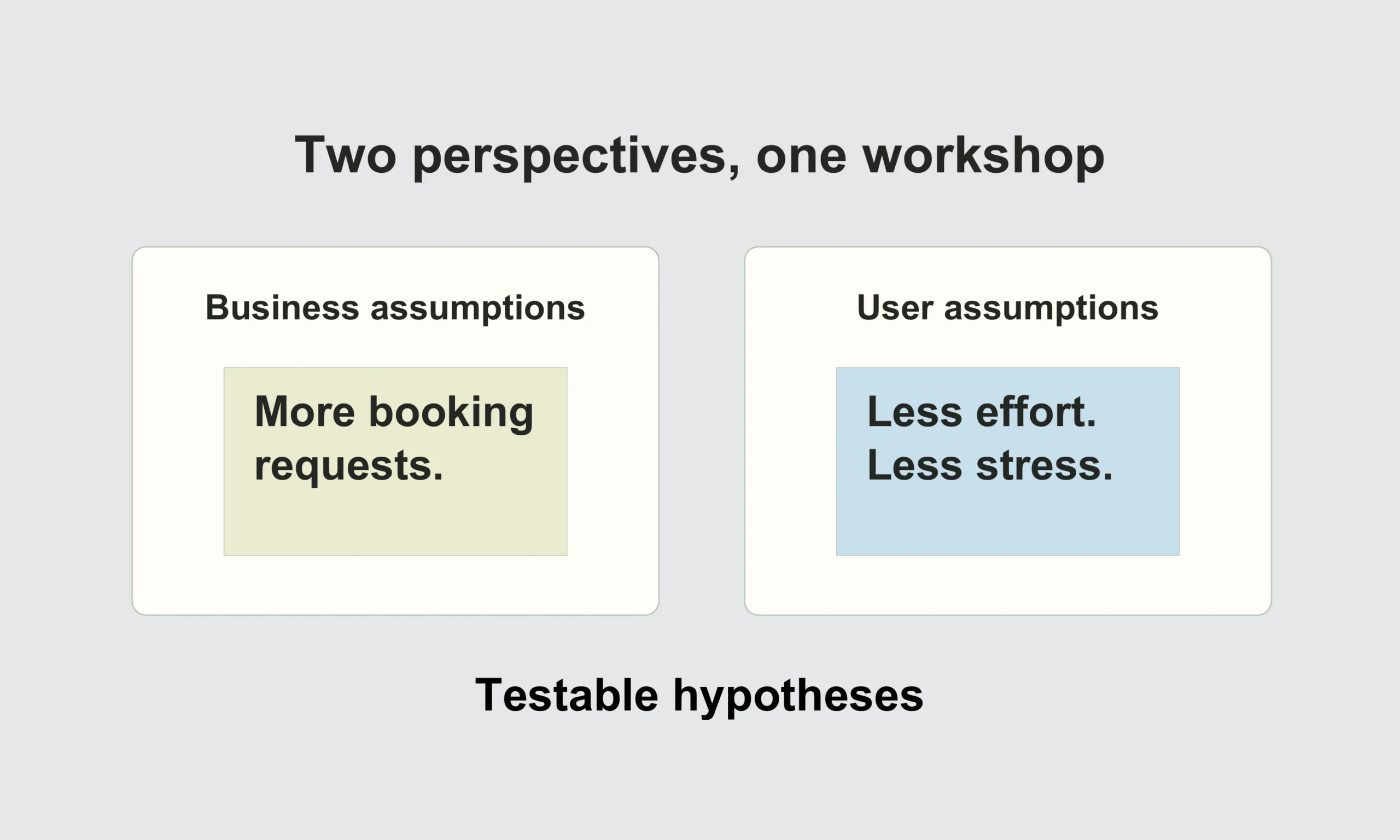
- business and user assumptions;
- an initial foundation for testable hypotheses.
02. HYPOTHESES
Making assumptions testable
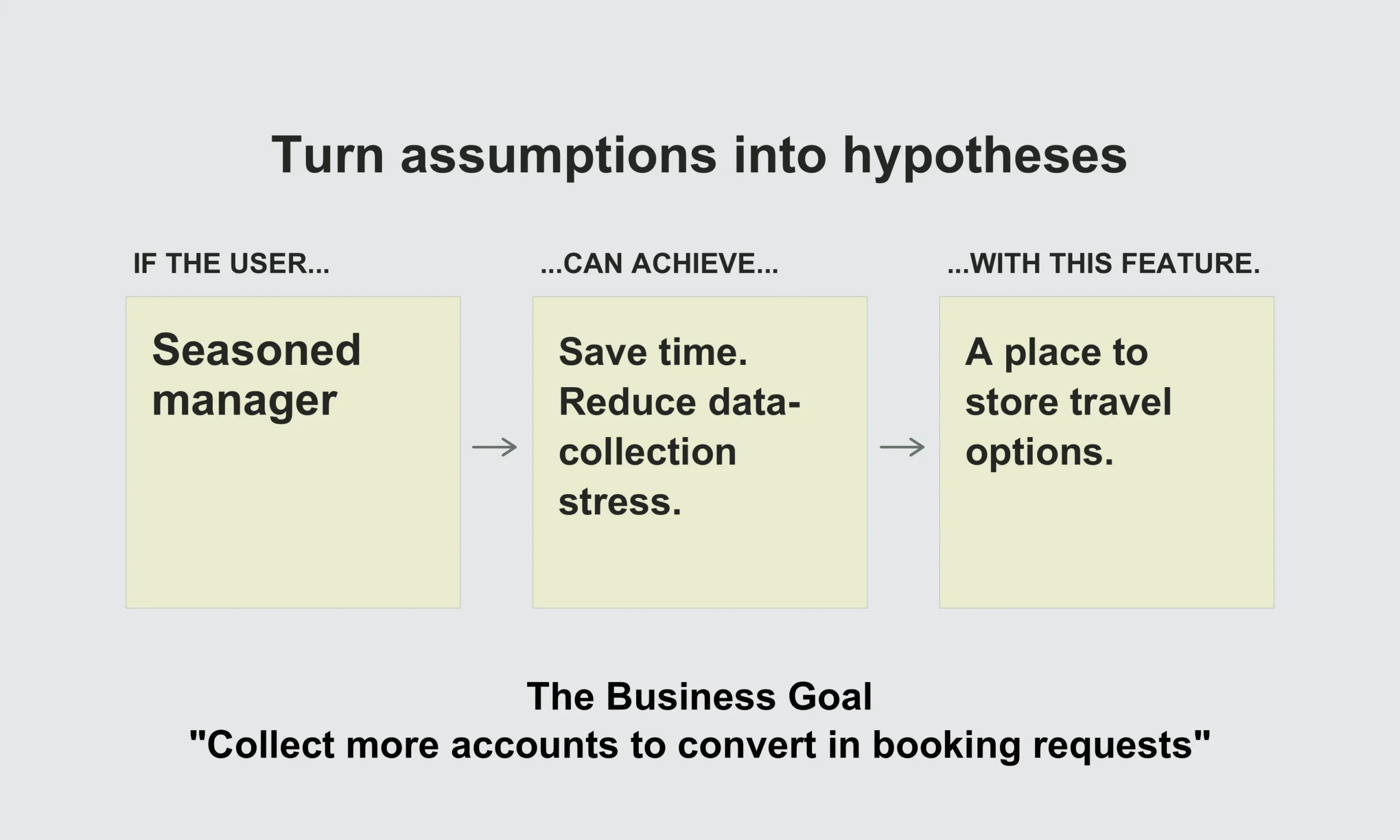
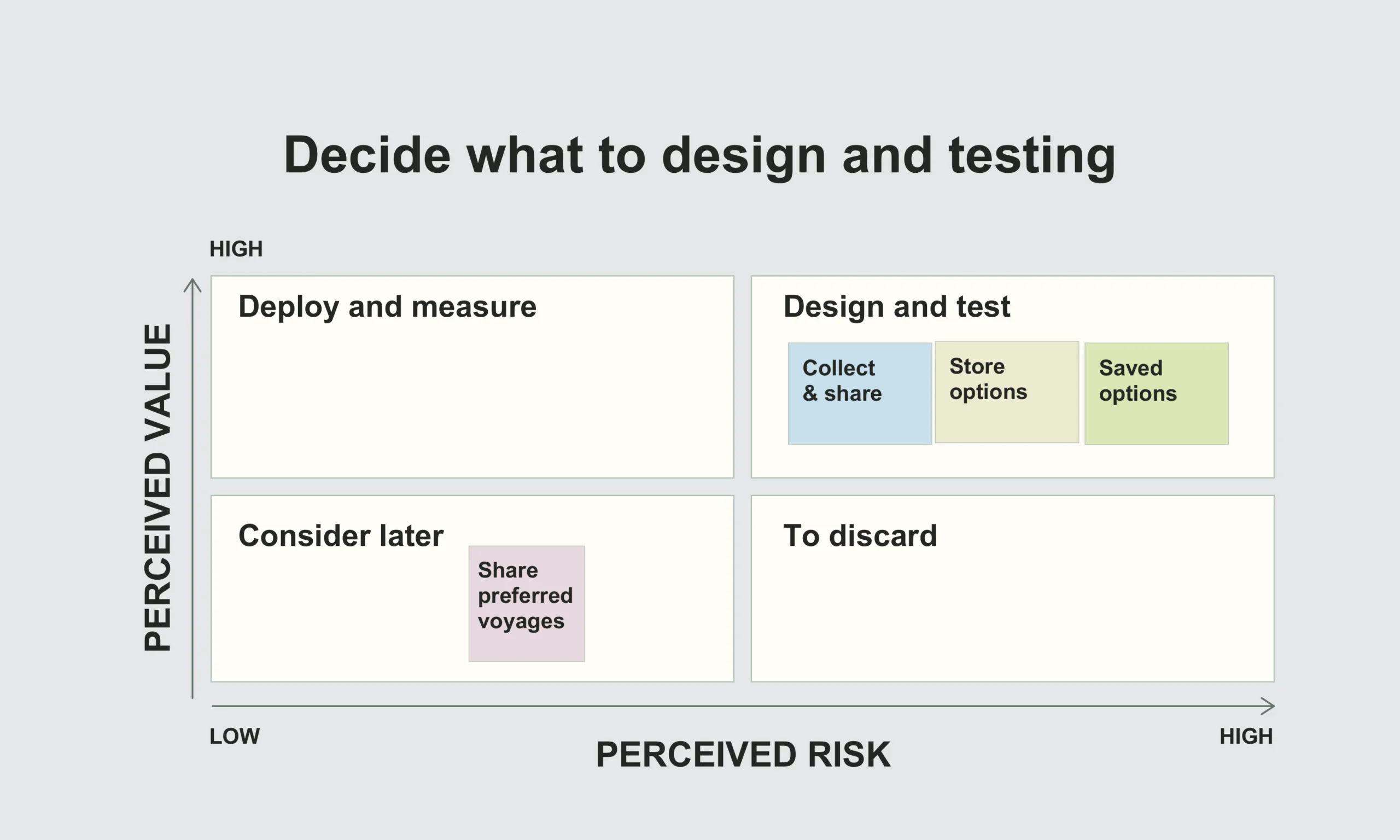
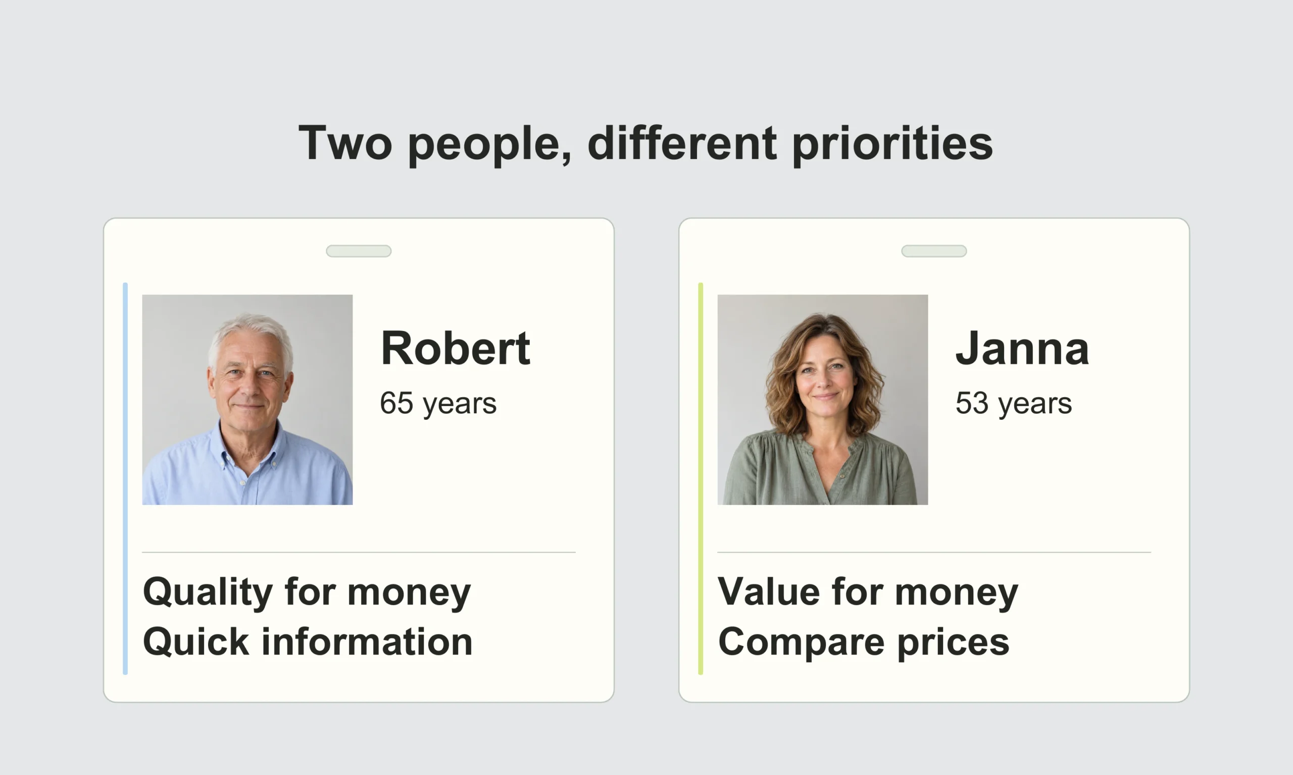
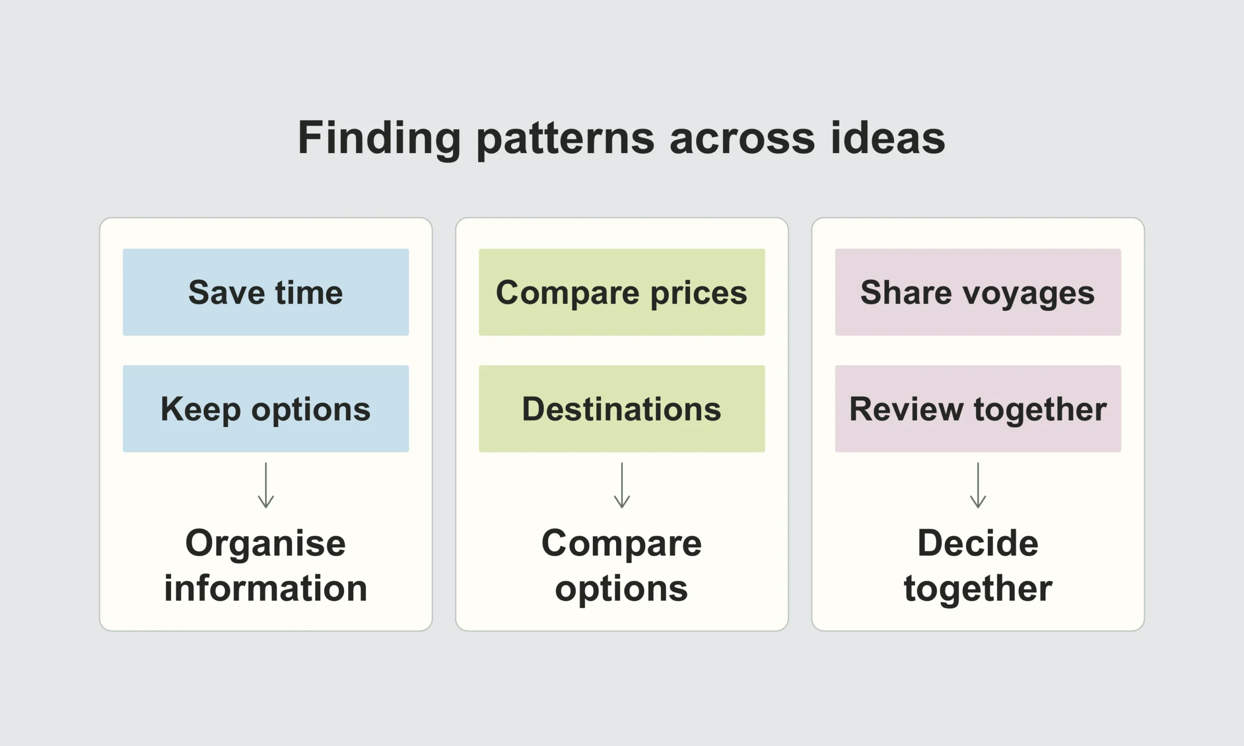
I planned and facilitated a full-day workshop in which the team explored the problem from the business and user points of view. We connected assumptions to proto-personas, organised related ideas in a hypothesis table, and prioritised which hypotheses were both important and suitable for validation.
This shifted the conversation from isolated feature ideas to shared statements that the team could test.
03. DESIGN
From collaborative ideas to an interactive prototype
With the prioritised hypotheses in place, I facilitated a second workshop focused on collaborative ideation. The team explored alternatives before converging on the most promising directions.
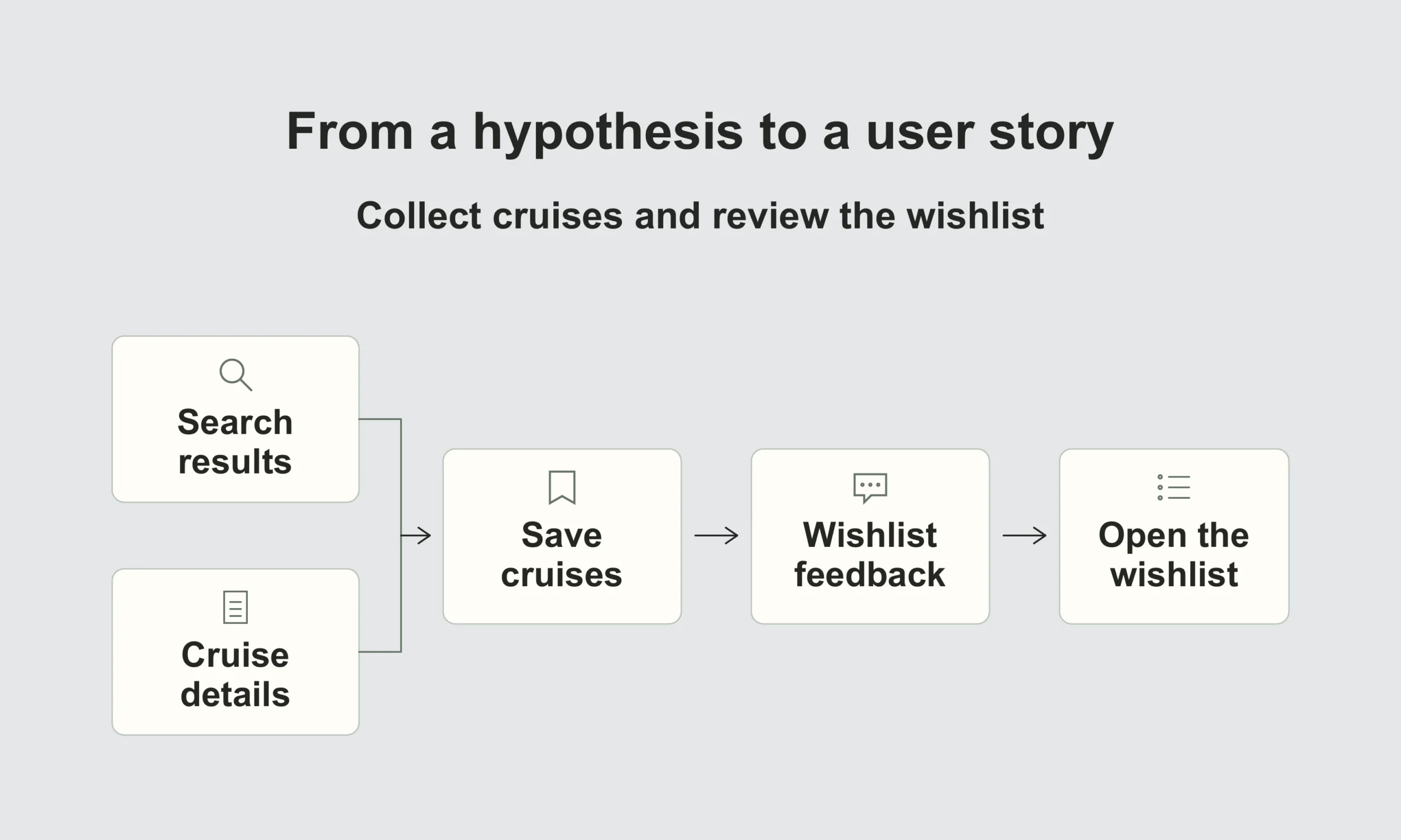
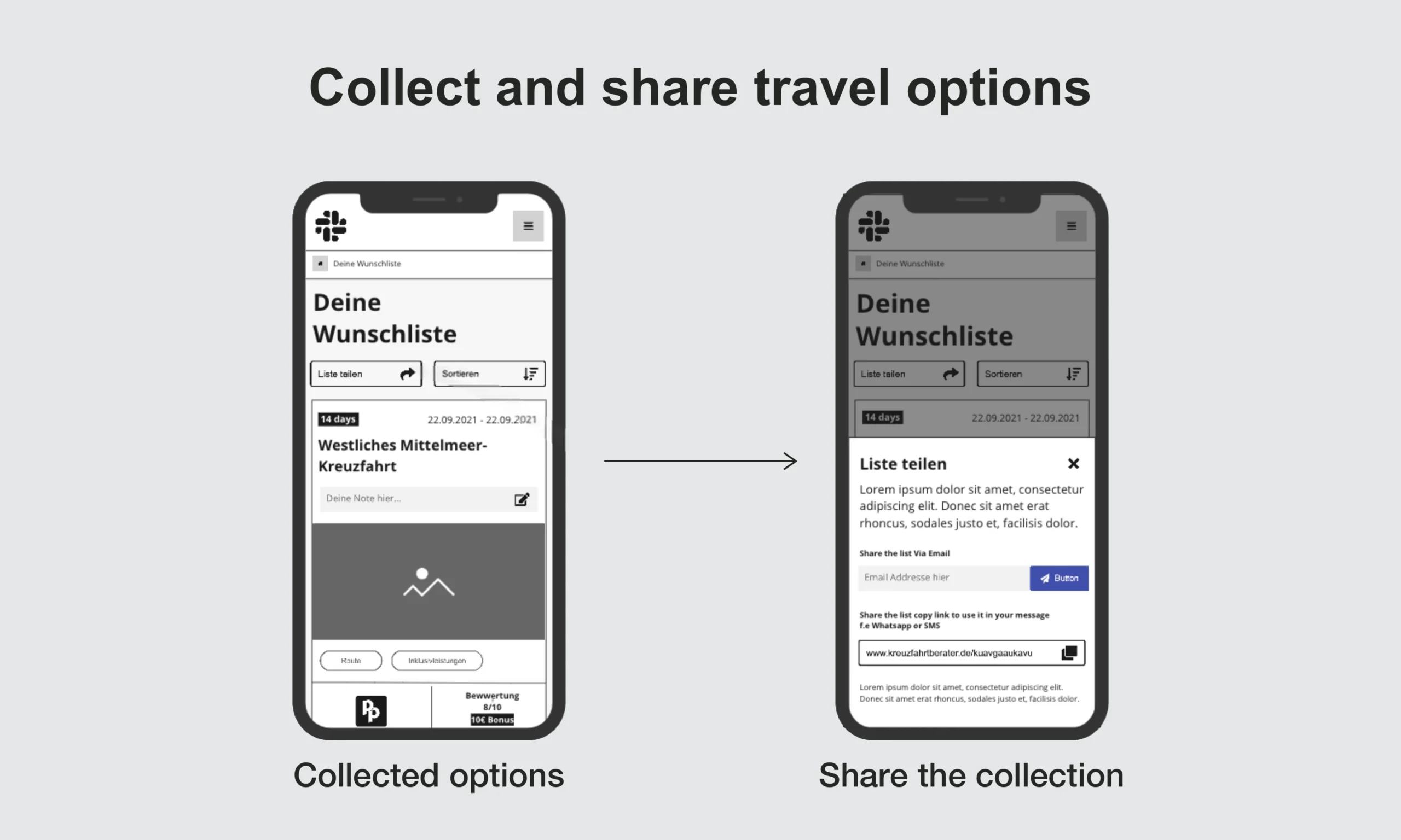
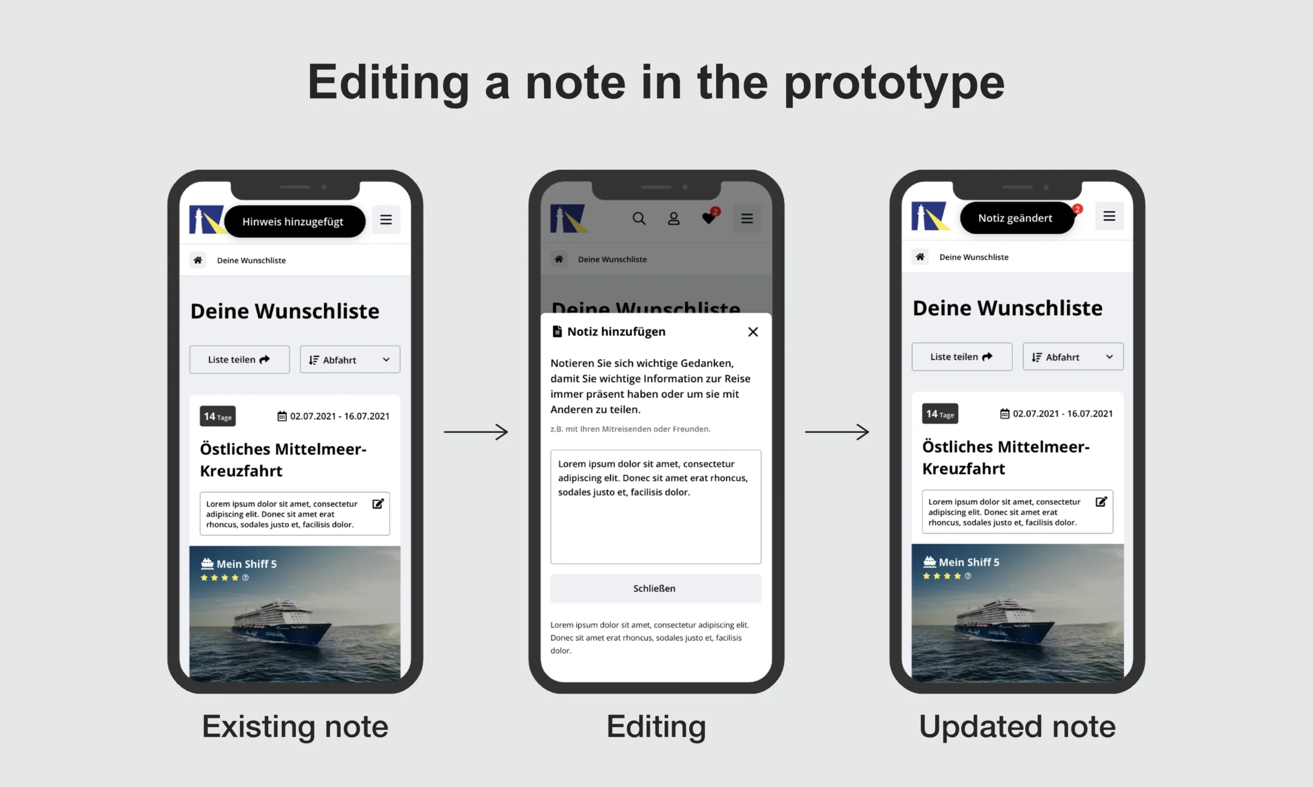
I was independently responsible for the UI and interaction design in Figma. I translated the selected concepts into user flows and high-fidelity screens, then built interactive prototypes in Principle so the experience could be evaluated before implementation.
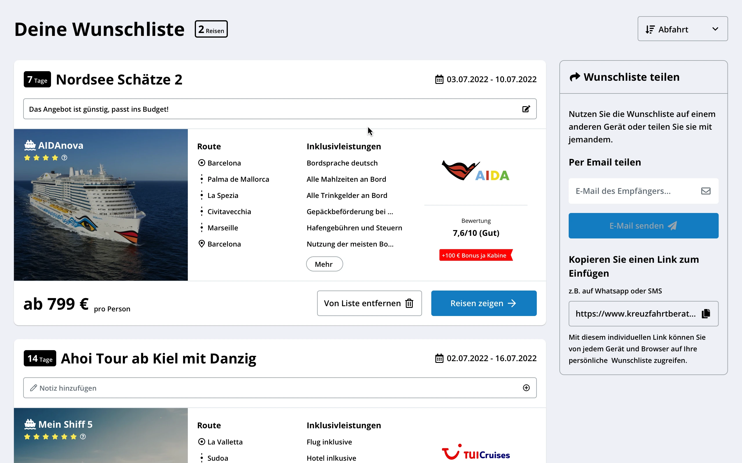
Mobile-first responsive design
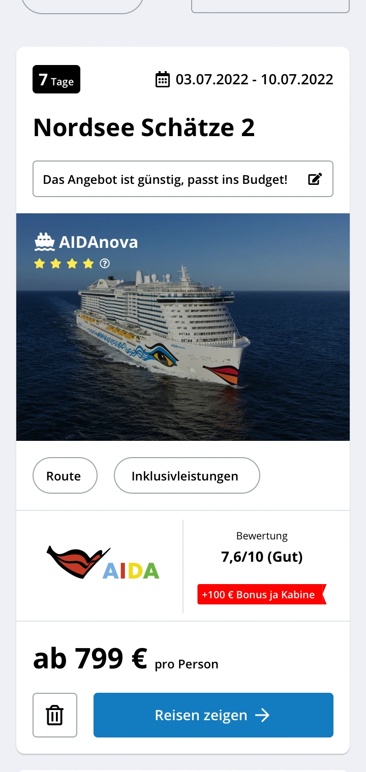
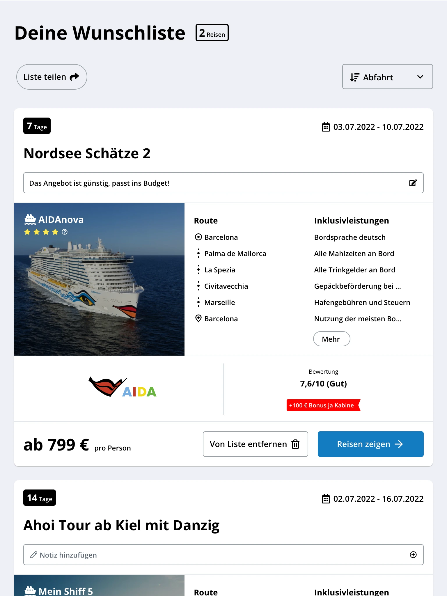
I designed the experience using a mobile-first approach, progressively adapting layouts, components, and interactions from smaller screens to tablets and large desktop displays. The following examples show how key features respond to different screen sizes while maintaining a consistent user experience.
04. VALIDATION
Testing, learning, and iterating
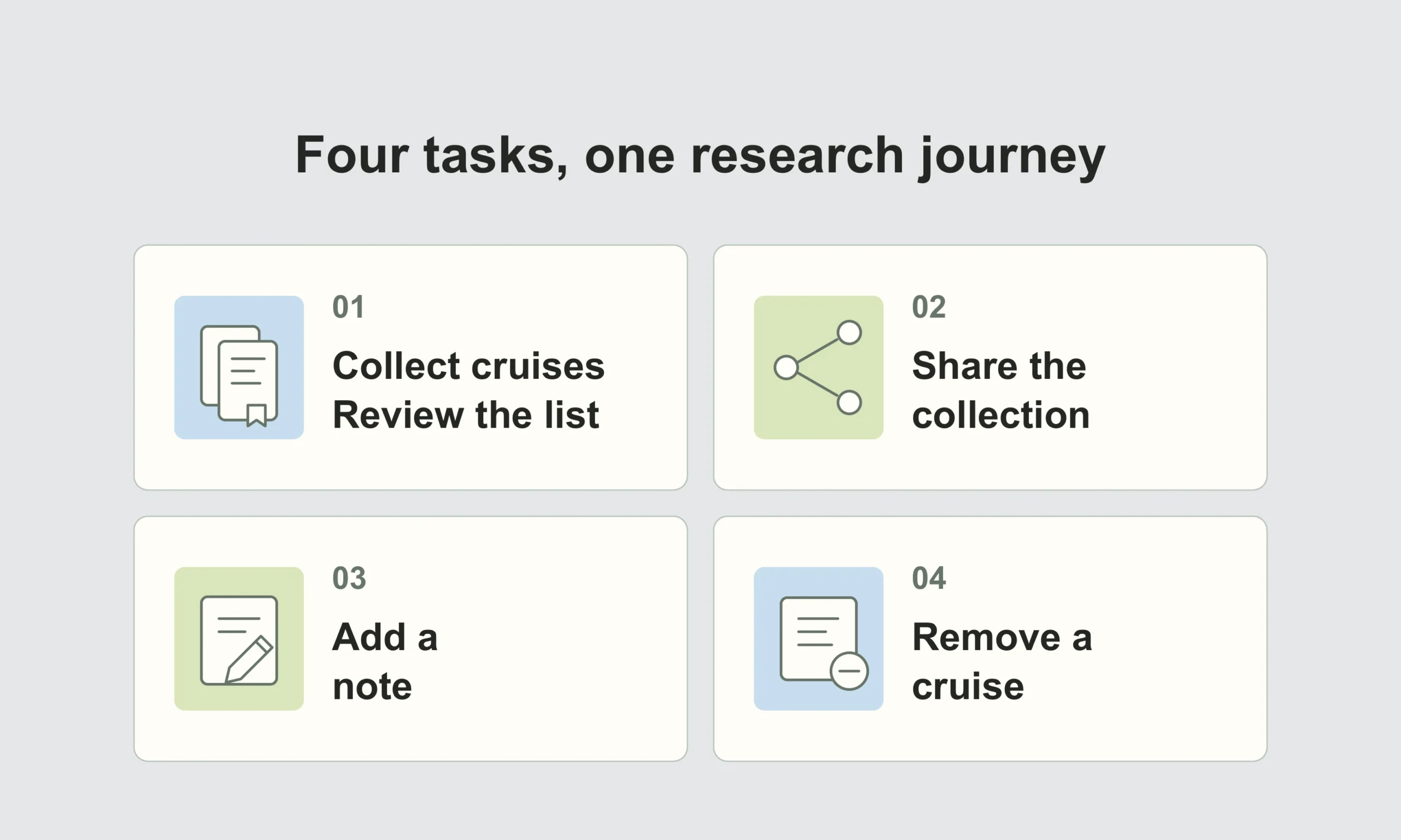
Recruiting suitable participants was challenging. I worked with Sales and Social Media Marketing on a two-week online campaign in which participants completed a gamified set of research tasks and received a €50 cruise voucher after finishing the experience.
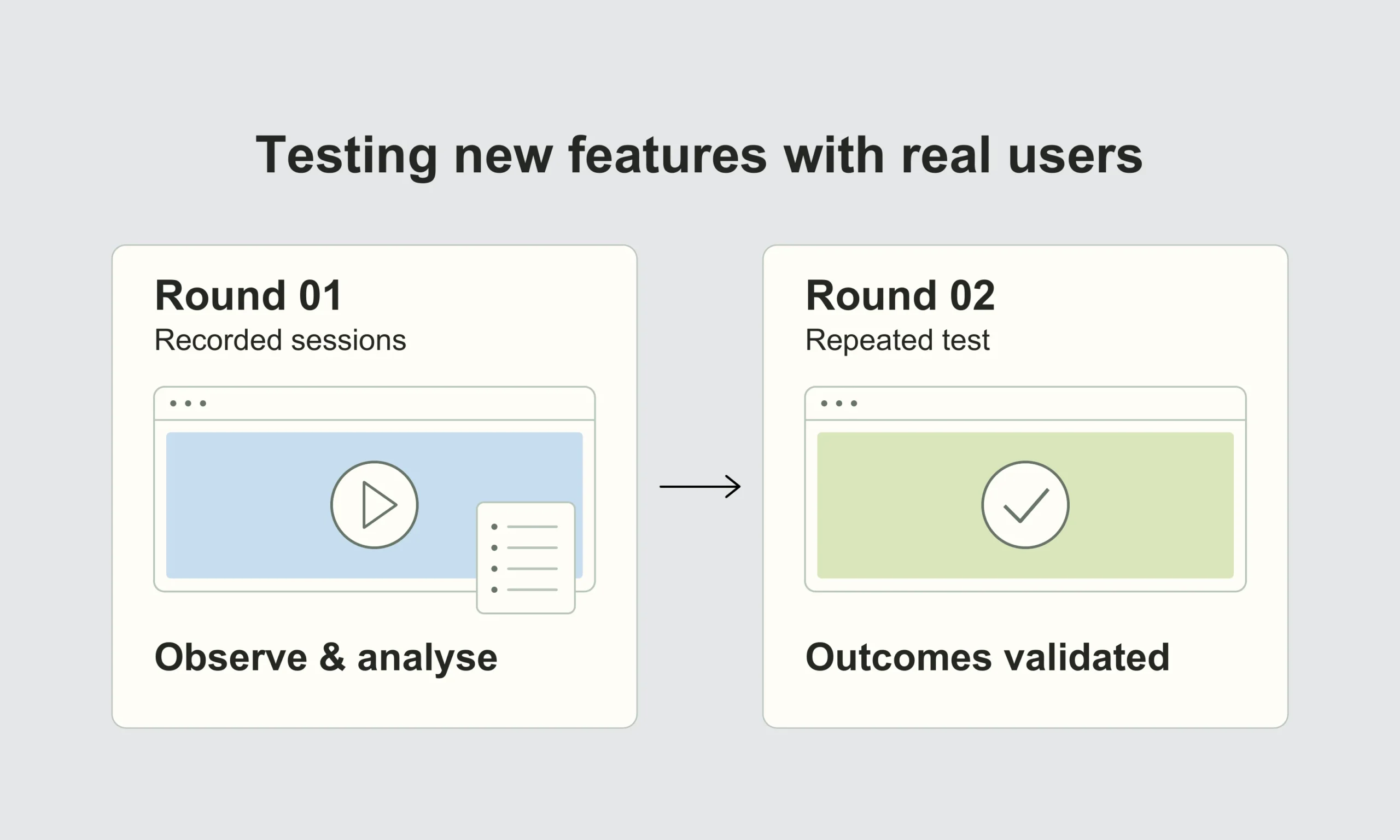
We ran the sessions remotely and unmoderated using Loop11. I organised the task-level findings in an observation table and shared the results with the team and stakeholders. The first round showed that the experience still needed refinement. I iterated the design and ran a second round, which validated the core user outcomes strongly enough for the team to proceed.
05. IMPLEMENTATION
Preparing the minimum viable feature
After validation, I prepared the final artboards, user flows, screens, and interactions for development. I worked with the developers throughout the handoff and took part in implementation reviews and quality assurance.
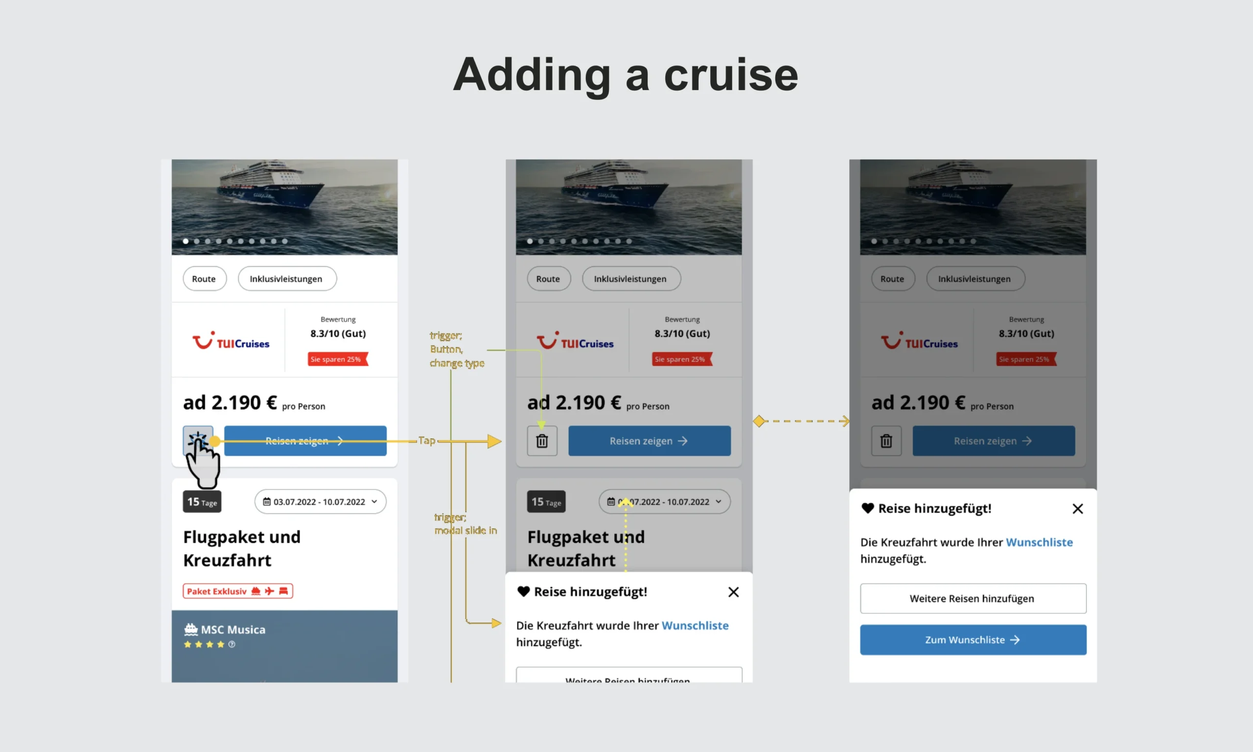
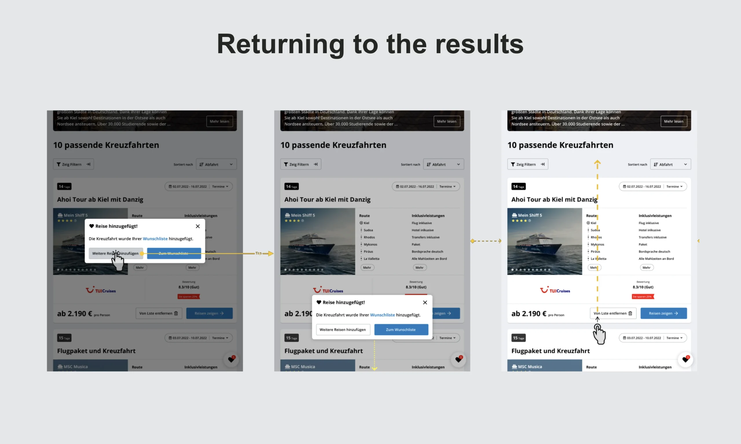
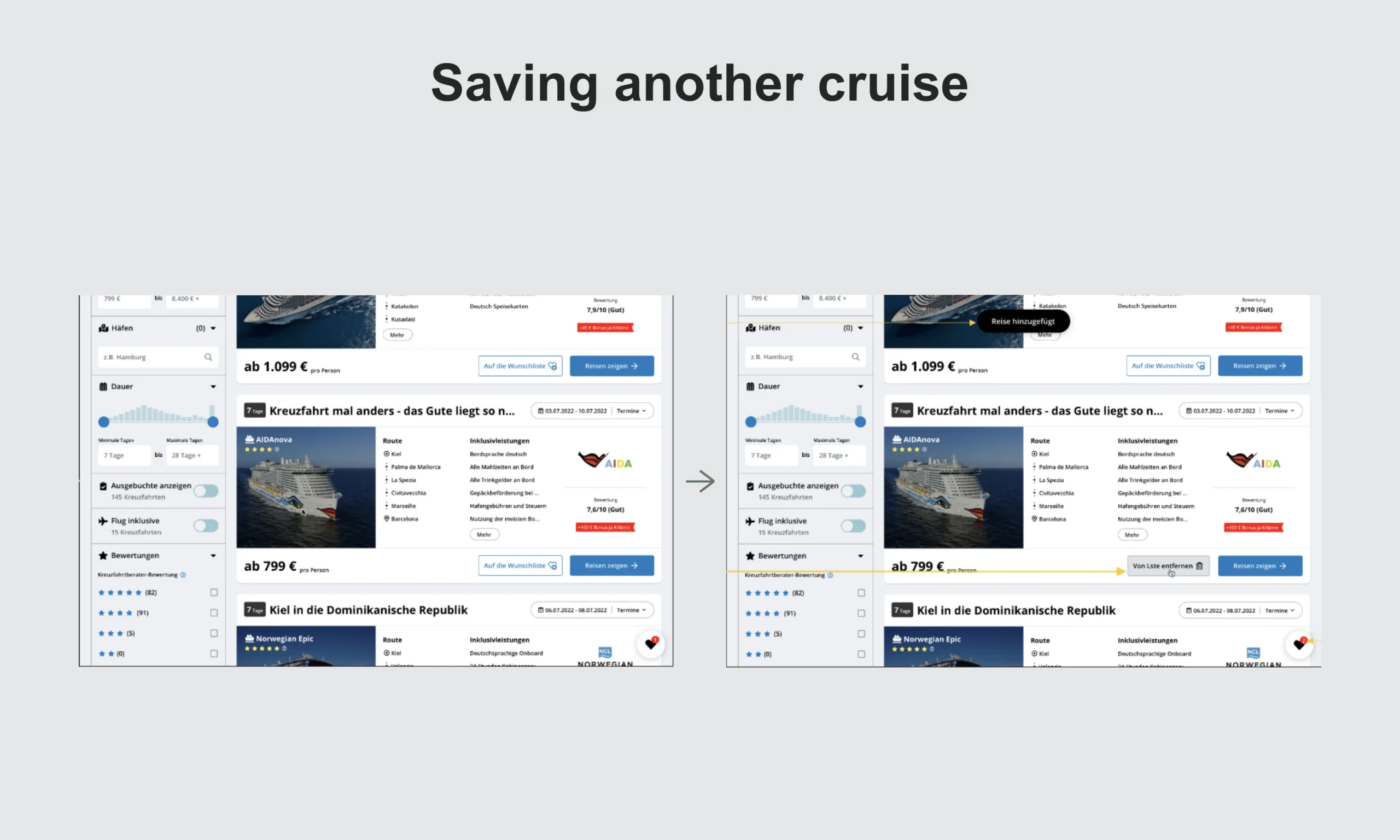
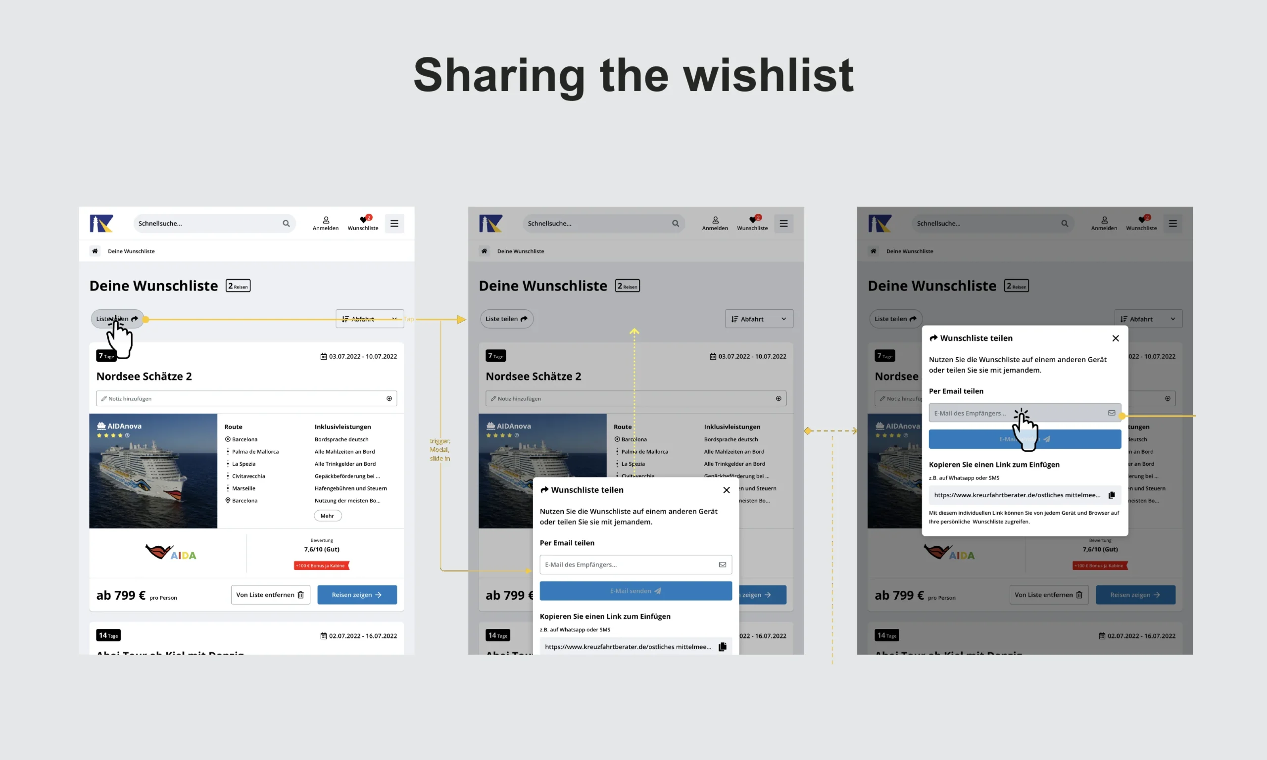
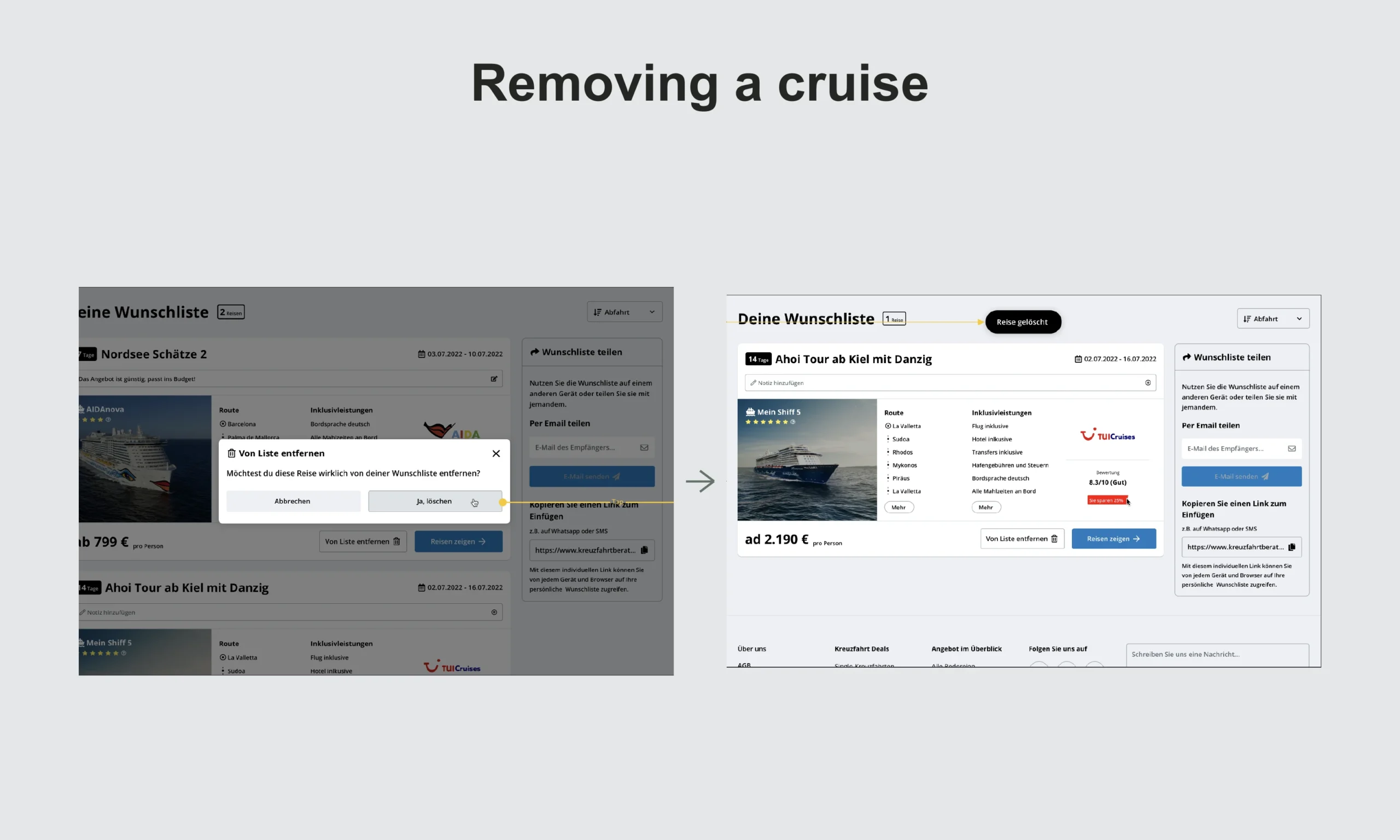
The resulting minimum viable feature redesigned existing pages and introduced new elements and features to simplify the research journey. It was then merged into the staging environment.
Outcome
Business and user assumptions became prioritised, testable hypotheses
The proposed experience was tested and refined across two iterations
The second round validated the core user outcomes
Existing research pages were redesigned with new UI elements and interactions
The final solution was handed over, reviewed during implementation, quality-checked, and merged into staging.Business and user assumptions became prioritised, testable hypotheses.
No post-launch analytics are available. The documented result is therefore the validated and implementation-ready experience, not an unverified increase in traffic or conversion.
What I learned
This project showed me the value of combining complementary frameworks instead of following one process mechanically. I used the Double Diamond as the overall structure, Lean UX to turn assumptions into hypotheses, collaborative workshops to align the team, and Agile user stories to connect design decisions to delivery.
The most important lesson was that early alignment and explicit hypotheses made later design discussions more focused. Testing did not simply approve the first solution: it created the evidence needed to refine the experience and validate a stronger direction.
Prev case
Next case
